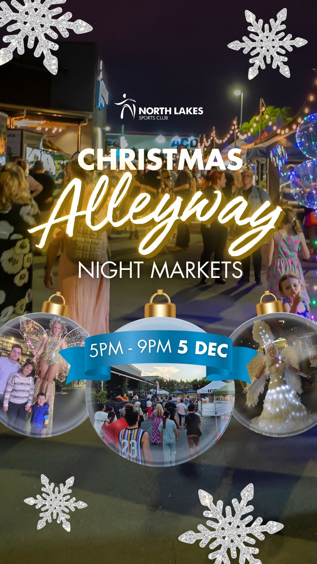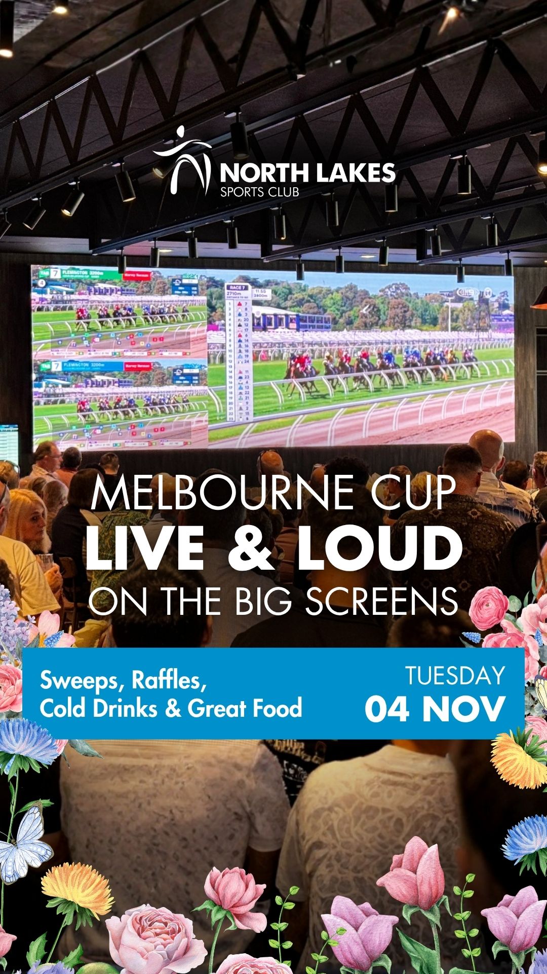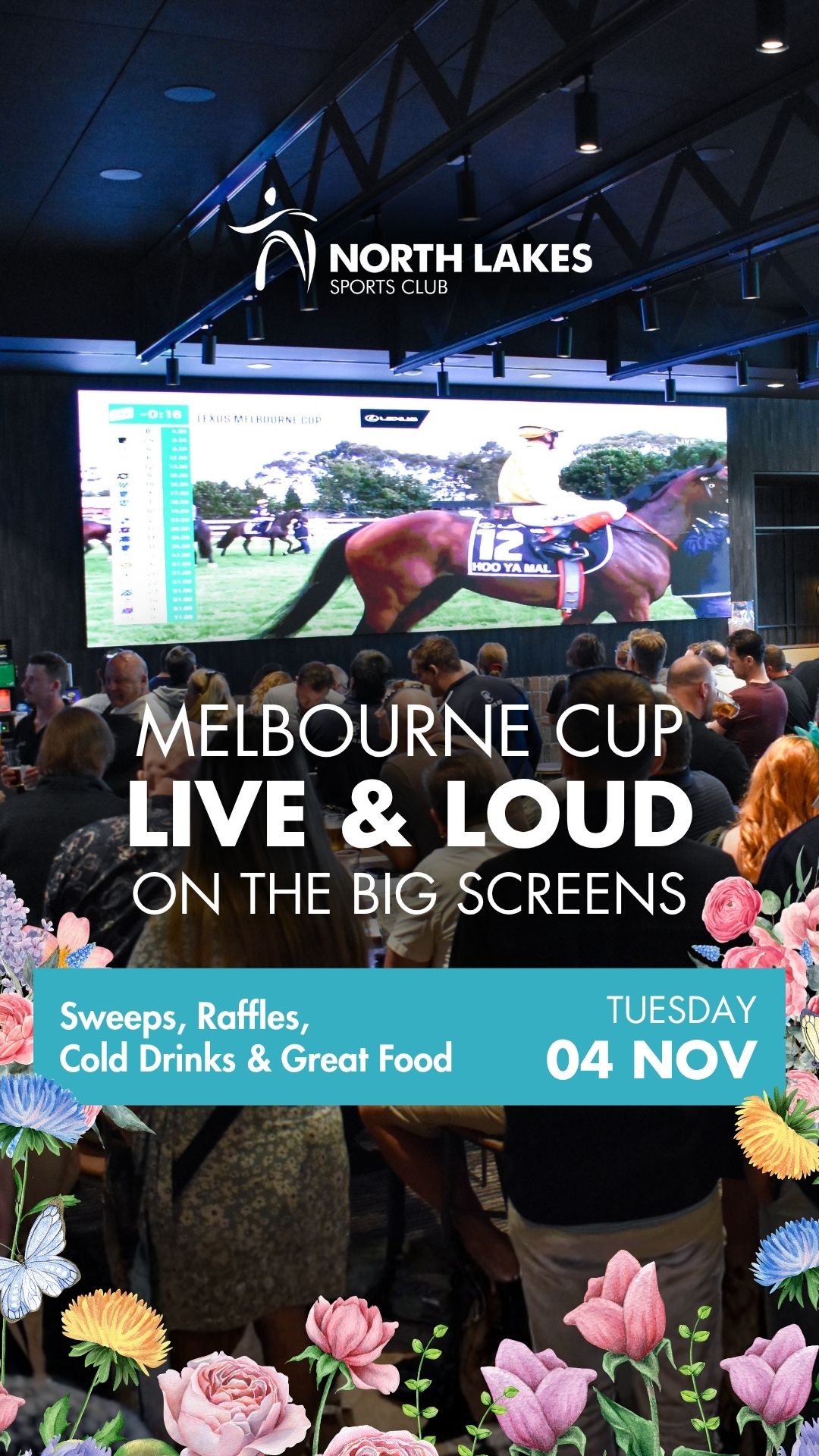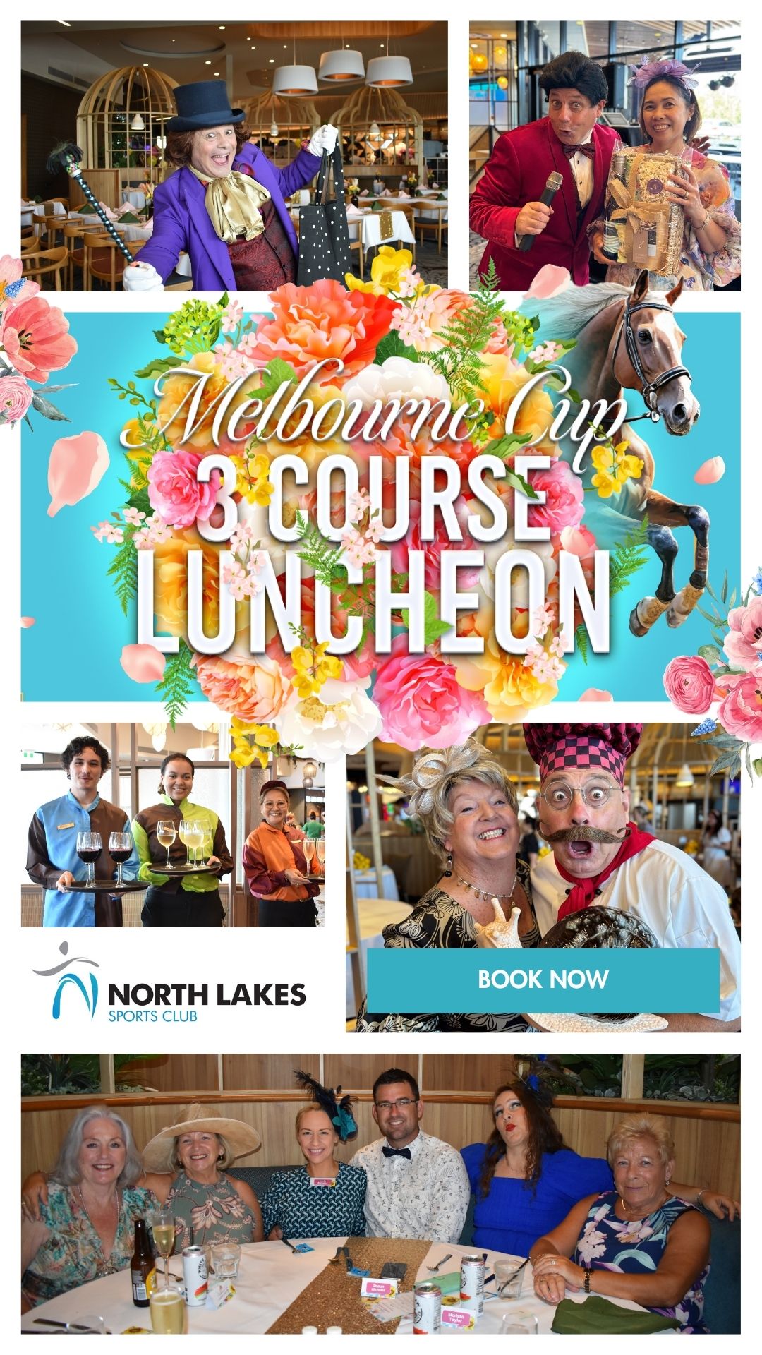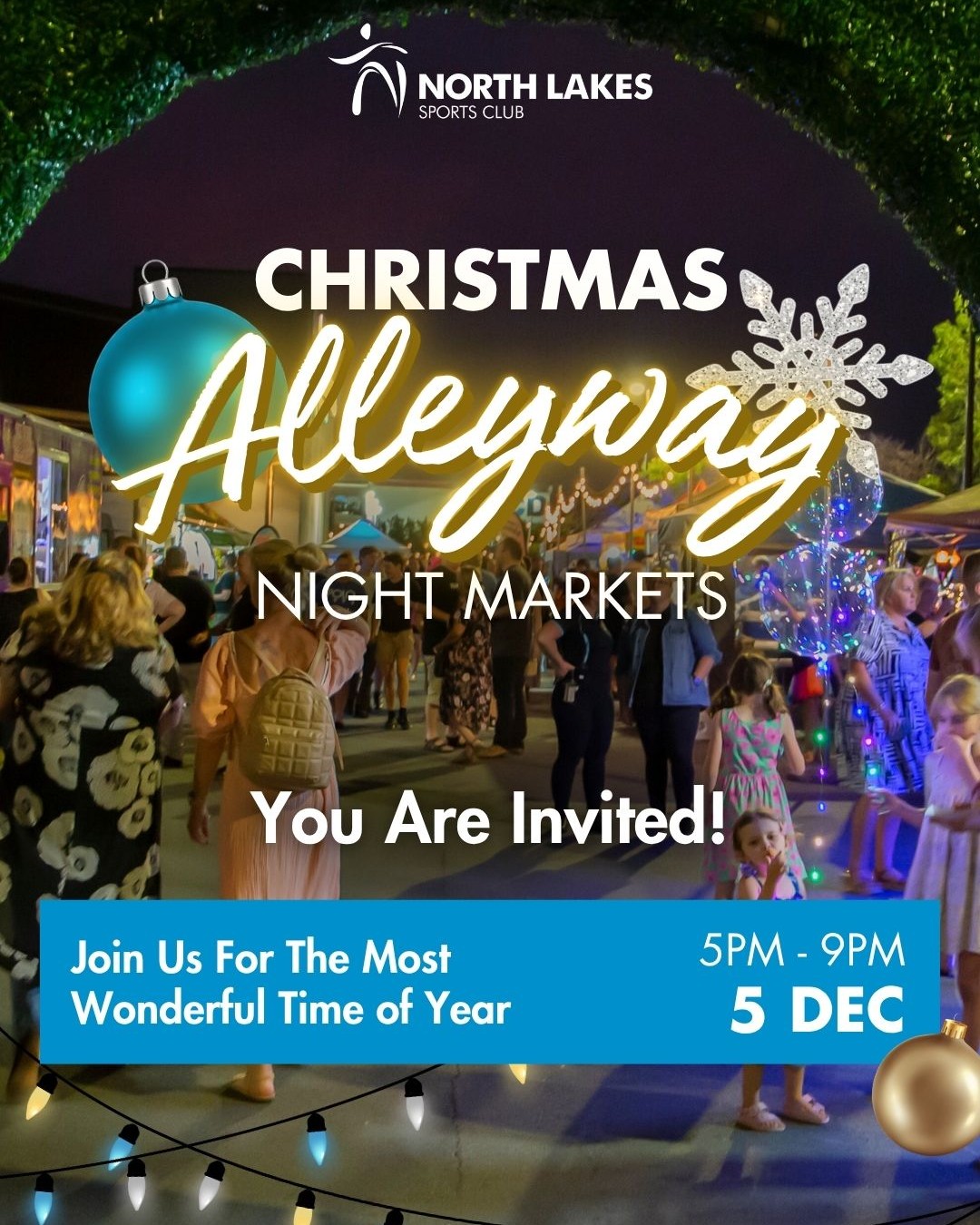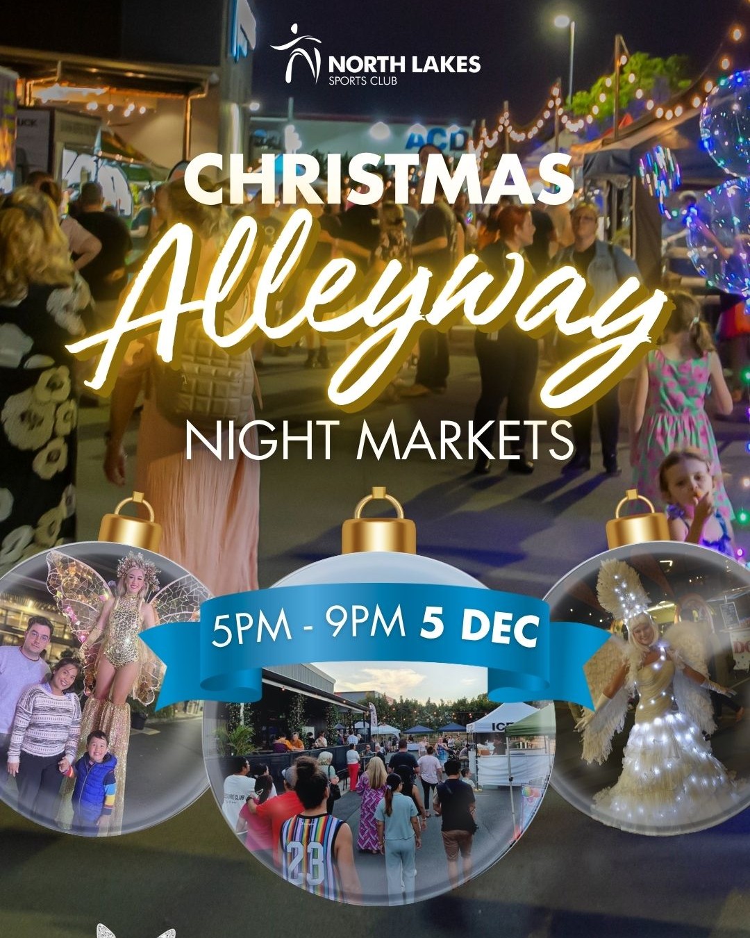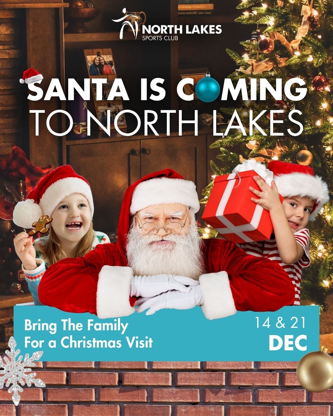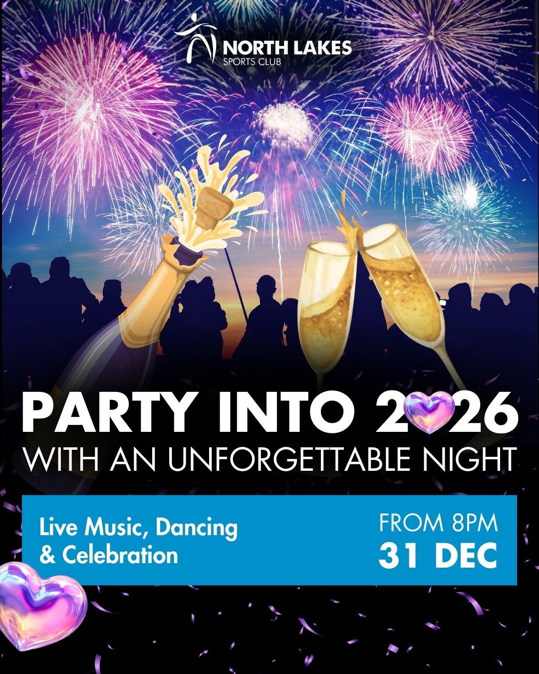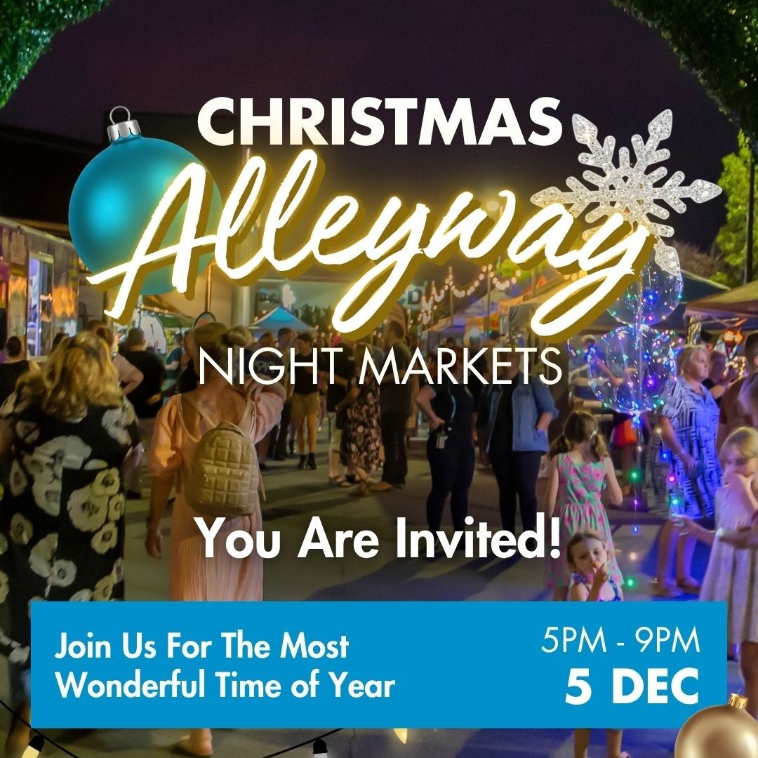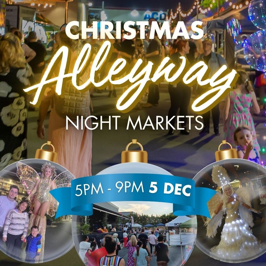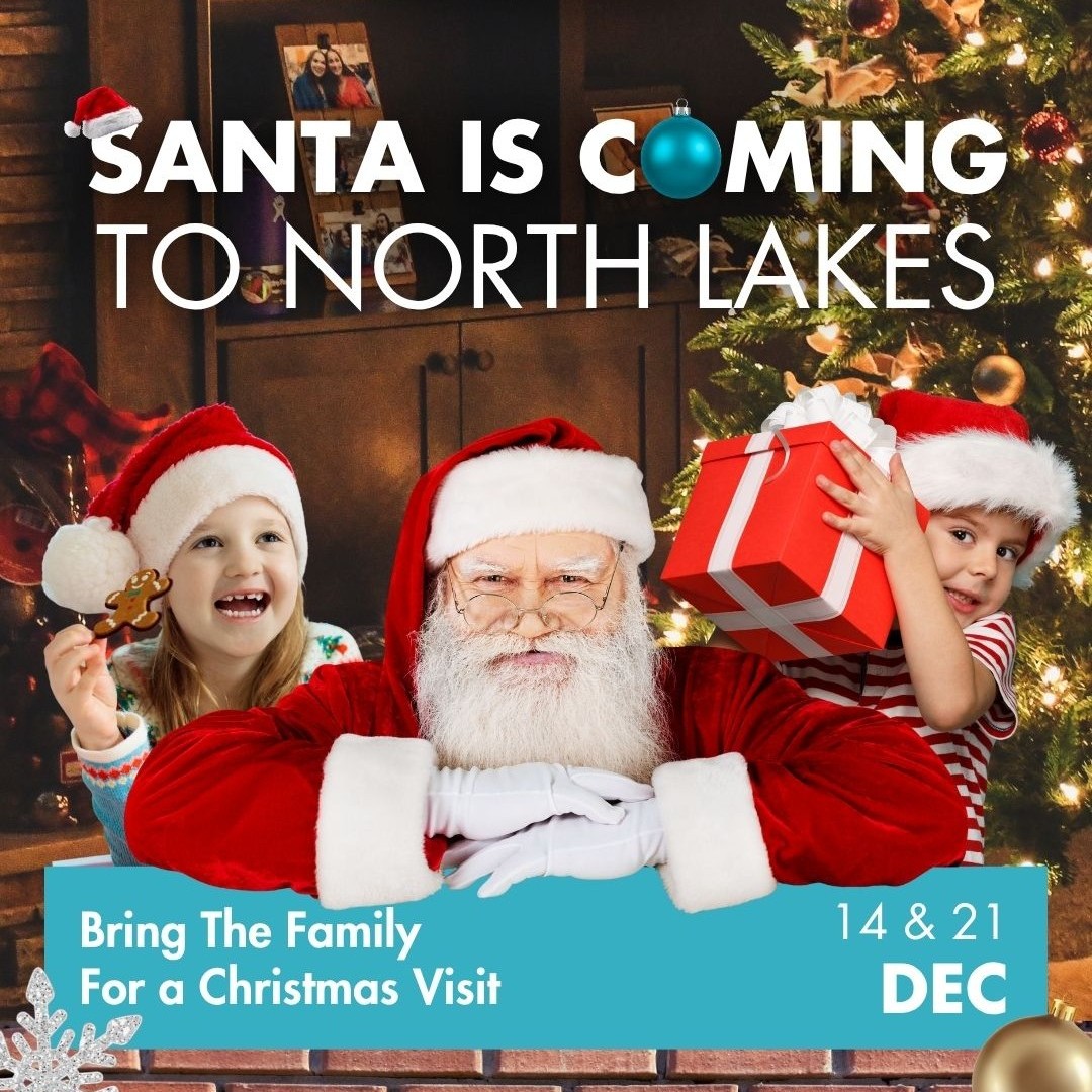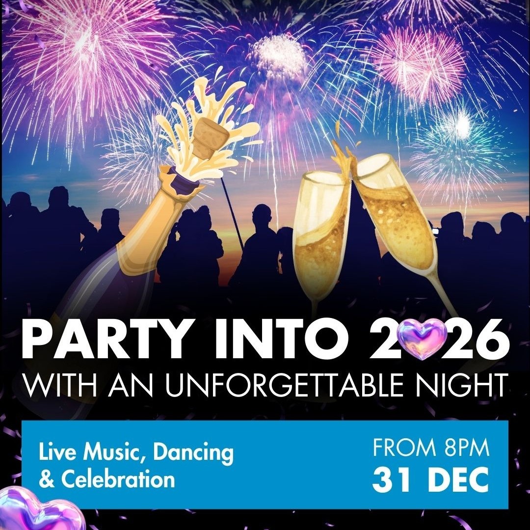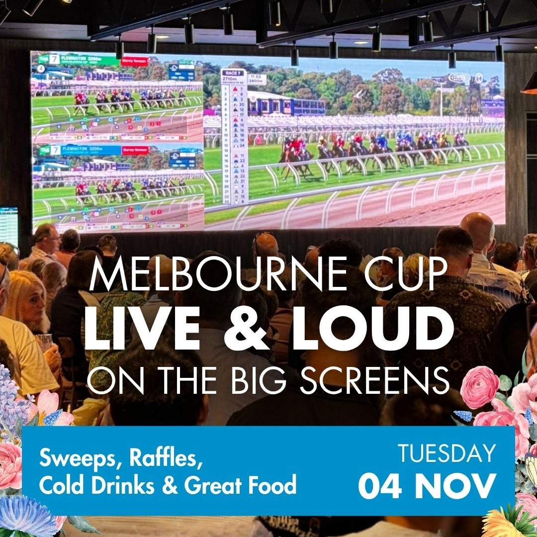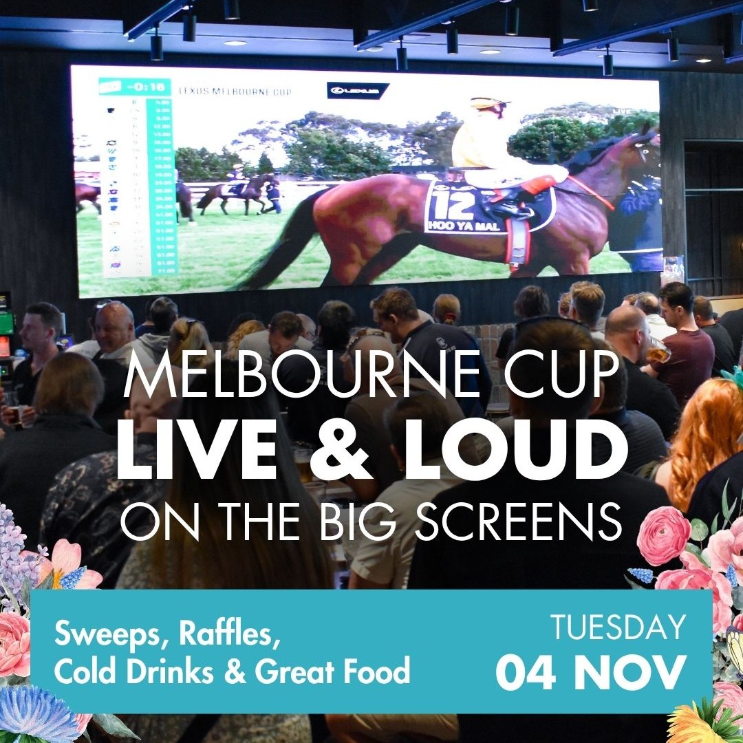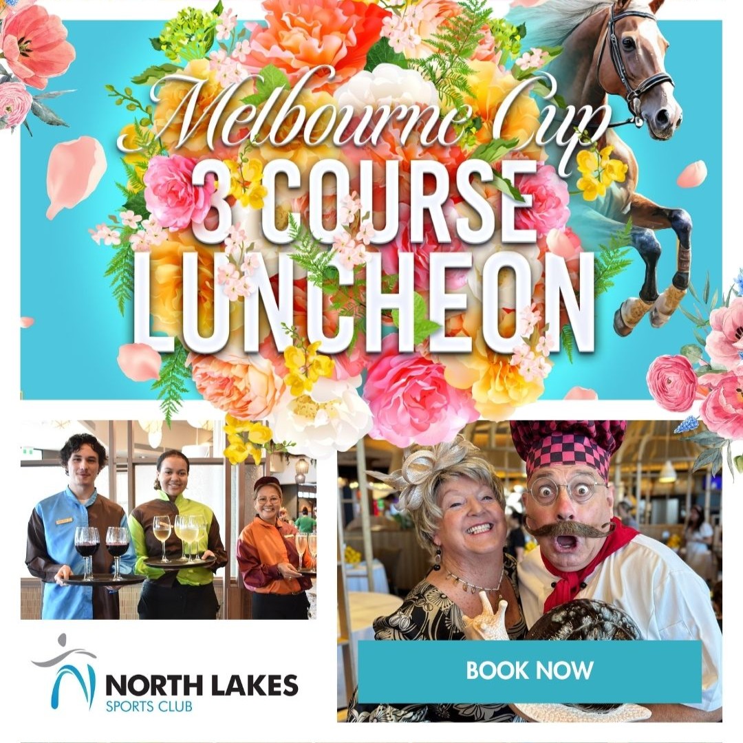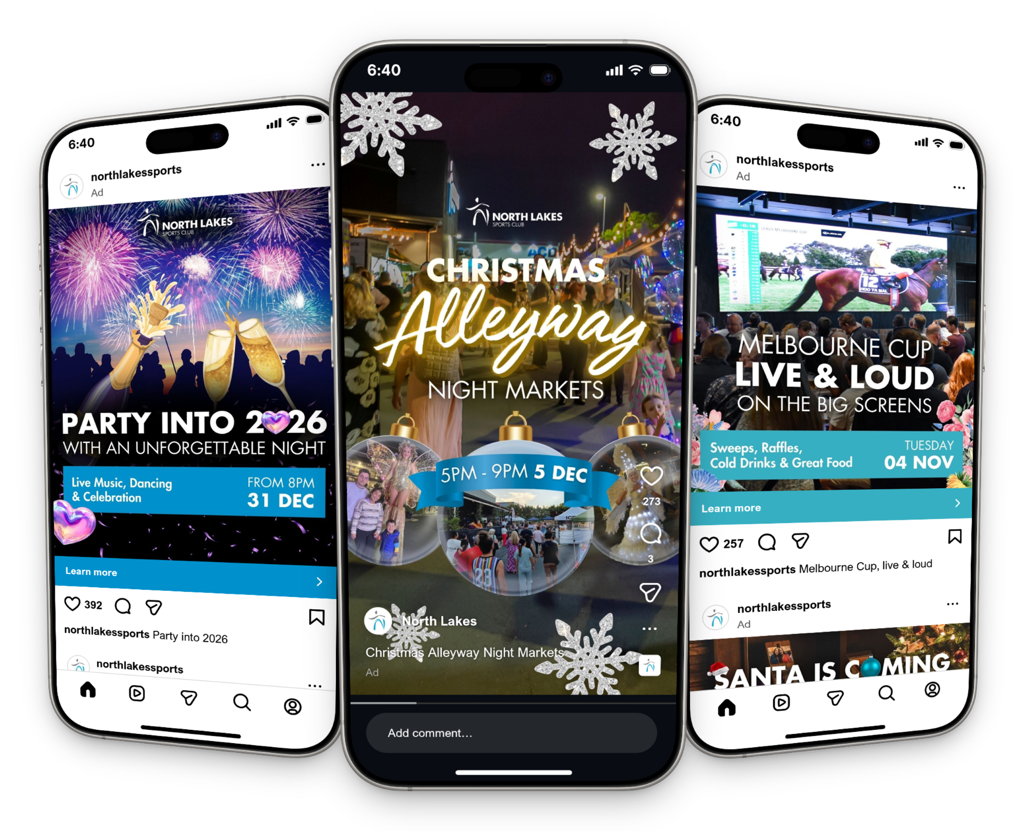

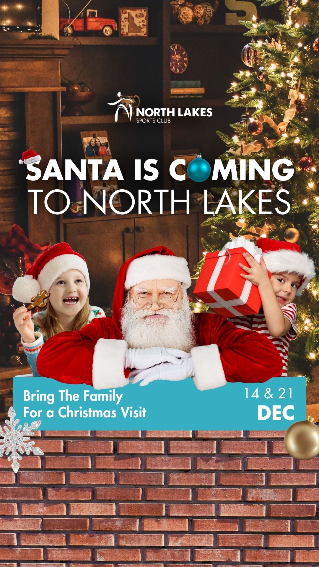
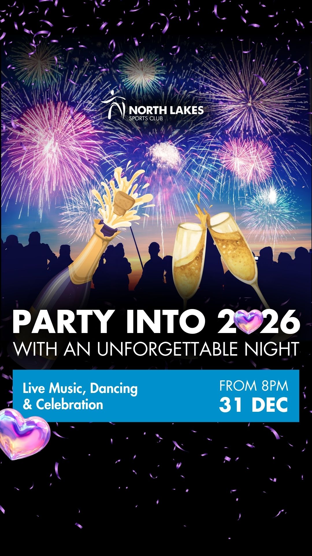
One social media ad client I worked with during my time as a Junior Designer at Edge Marketing was North Lakes Sports Club. While their branding is simple and clean, the seasonal nature of their ad campaigns resulted in a range of attention-grabbing designs. Despite each of these designs requiring unique colour schemes and imagery, my application of the client's brand identity maintains a sense of consistency.
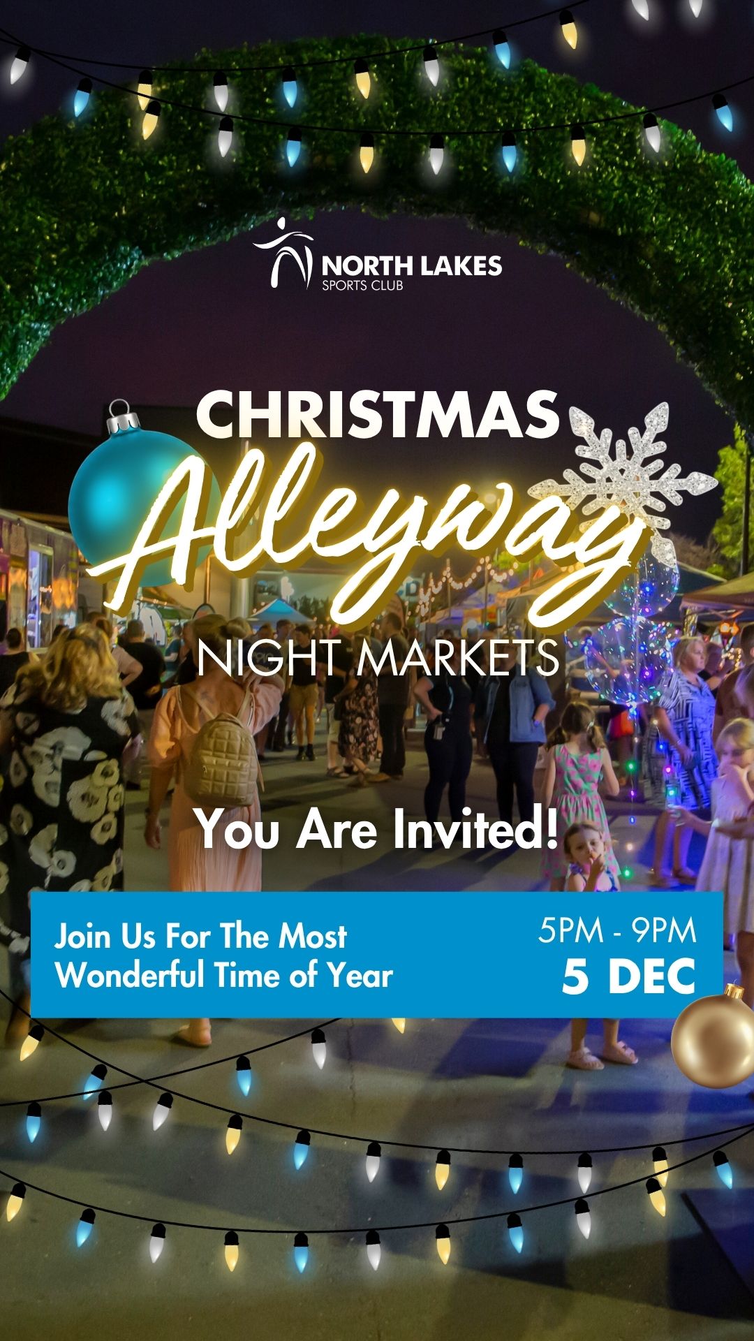
When creating a single design to work across multiple ad formats, it is essential that viewers do not notice the lack of content in smaller formats nor the extra white space in larger formats. For North Lakes' ads, I omitted the logo from the square format – as the name is already on the account – and added extra visual flourishes to mask the white space in the story format.
As North Lakes' designs were frequently seasonally themed, I ensured that the base design language was simple and remained consistent between ads for improved brand recognition. This approach allowed for the creation of fun, eye-catching themed designs that still fit into a broader brand identity.


Header Font

Subheader Font

Body Font
#0091CD
#37AFC3
#FFFFFF
#000000